A website stuck in the single-location era
Old School Arcade is exactly what it sounds like: a cool retro arcade with classic machines, the kind of place that doesn't fit a generic modern website template. The brand has a personality — and that personality was completely absent from a poorly designed 2010s website that hadn't kept up with the business.
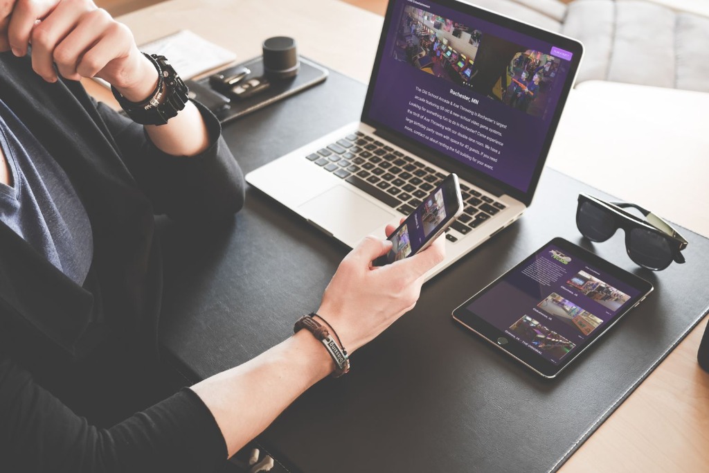
When Old School Arcade was one location, the site served its purpose. But the business had grown to four locations — and the website was still built for one. The other three locations were buried or effectively invisible. Someone searching for the Mankato location, for example, would land on a site that led with Rochester above everything else.
The site also felt mismatched to the brand. Retro arcades have a vibe — neon, nostalgia, the specific warmth of a CRT screen. The old website had none of that. It felt like any other small business site from 2014.
Modernized, retroized, and equalized
The brief was clear: modernize the site while leaning into the retro arcade aesthetic, and give all four locations equal weight and usefulness. No location should feel like an afterthought on their own website.
I pulled the purple from their main logo as the anchor color — it was already their brand identity, it just hadn't been used consistently across the website. That purple became the through-line: in the location selector, the navigation, the hover states, the section accents.
The new main page leads with a clean location chooser — the first thing a visitor sees is a prompt to pick their location, which immediately routes them to a version of the site built for that specific place. Hours, address, events, and content specific to each location, all under one unified design.
A site that matches the brand — and works for the whole business
The completed project is live at theoldschoolarcade.com. A four-location arcade with a website that finally treats it like a four-location business — and looks the part while doing it.
The redesign shows what happens when you take the brand's own visual language seriously and let it lead the design rather than applying a generic template. The purple was already there. The personality was already there. The website just needed to catch up.